Form Controls: button / input / search / select / rating / slider / datepicker / colorpicker / upload
All of these are controlled components: display follows props only, and interaction only dispatches callbacks (see convention ③ in Section 0). The one exception is <upload>: the result of picking files (paths handed out by the OS) cannot be constructed by the script, so it is controlled/uncontrolled dual-mode.
The Screenshots Are Rendered, Not Drawn
The screenshot at the top of each section is produced by offscreen-rasterizing testdata/shots/<component>.js (popup components are captured in their open state) — it is exactly what the render layer paints. The repository carries the macOS set; Windows / Linux sets come from the CI matrix as artifacts — fonts come from each platform's system fonts, so the three platforms are supposed to differ. Regenerate locally with GOX_SHOTS_OUT=<dir> go test ./gfx/ -run TestGalleryShotScripts.
<button>
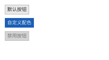
Stable · Controlled appearance
A button. Sizes to its content (text + 8px horizontal padding) with vertically centered text; includes hover brightening and pressed-darkening feedback.
| Prop | Type | Description |
|---|---|---|
| onClick | function | Fires on left-button release. The callback takes no arguments |
| disabled | boolean | Uniformly desaturated, clicks are intercepted, and it doesn't grab keyboard focus |
| background | color | Accent color, defaults to light gray #e8e8e8 |
| border | color | Defaults to 1px #999 |
| color | color | Text color, defaults to dark |
<button onClick={() => setCount(c => c + 1)}>默认按钮</button>

<button
  background="#1a5fb4"
  border="#1a5fb4"
  color="#ffffff"
  onClick={() => setCount(c => c + 1)}
>自定义配色</button>

<button disabled={true} onClick={() => setCount(c => c + 100)}>禁用按钮</button>Keyboard: after Tab lands on a button, Enter or Space = click (both go through the same onClick outlet — no separate keyboard code path). Icon buttons (graphics without text) need a name: aria-label="Delete" — otherwise focusOrder() reports an anonymous control.
<checkbox> / <radio> / <switch>

Stable · Purely controlled
Three boolean toggle controls. The checkbox is 18×18, the switch is 36×20 (square track + 16×16 thumb), and the radio is a 1px circle ring + a solid center dot. None of the three holds any state of its own — checked or not is decided entirely by the checked prop.
| Prop | Type | Description |
|---|---|---|
| checked | boolean / function | Whether selected. Usually pass a function bound to a signal |
| onClick | function | Fires on click with no arguments; flip the signal yourself in the callback |
| disabled | boolean | Clicks are intercepted |
| background | color | Fill color in the selected state (accent-color semantics) |
Radio Exclusivity Is Up to You
There is no "radio group" in the kernel. The approach is to have a group of radios share one signal and write checked as a "value equals" comparison — no extra group container needed.
const [agree, setAgree] = createSignal(false);
const [size, setSize] = createSignal("S");
const [notify, setNotify] = createSignal(true);

<row gap={8} alignItems="center">
  <checkbox checked={() => agree()} onClick={() => setAgree(v => !v)} />
  <text>{() => (agree() ? "Agreed" : "Not agreed")}</text>
</row>

<!-- Exclusivity via "shared signal + value comparison" -->
<row gap={14} alignItems="center">
  <row gap={4} alignItems="center">
    <radio checked={() => size() === "S"} onClick={() => setSize("S")} />
    <text>S</text>
  </row>
  <row gap={4} alignItems="center">
    <radio checked={() => size() === "M"} onClick={() => setSize("M")} />
    <text>M</text>
  </row>
</row>

<row gap={8} alignItems="center">
  <switch checked={() => notify()} onClick={() => setNotify(v => !v)} />
  <text>{() => (notify() ? "Notifications on" : "Notifications off")}</text>
</row>Keyboard: all three are in the Tab order; Enter / Space = click (through the same onClick), so the toggle logic doesn't need a keyboard rewrite. A group of radios takes one Tab stop (the stop is "the currently selected one", or the first in the group when nothing is selected); inside the group, ← / ↑ / → / ↓ move and selection follows focus (ARIA convention).
The radio grouping key is the name prop; without it, "same parent node" is the group — so "two radios side by side as toggles" doesn't force a name onto you, but two groups of radios inside one container must get distinct names.
<input>
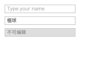
Stable · IME: Windows only
Single-line text input. On focus, the border turns blue and a blinking caret appears; clicking anywhere in the box places the caret at the nearest character boundary. Supports Backspace / Delete / ← / → / Home / End, plus batch commits from Chinese IMEs on Windows.
| Prop | Type | Description |
|---|---|---|
| value | string / function | Displayed content; display follows only this |
| model | signal / [get, set] | Two-way binding directive: one directive replaces the two props above (value + onInput); the recommended style. See convention ③ in Section 0 |
| onInput | function | Dispatched when content changes, receives {value} (string). Moving the caret does not dispatch |
| placeholder | string | Shown in gray when the value is empty; the caret stays at the far left and is not pushed away by the placeholder |
| onKeyDown / onKeyUp | function | Unconsumed keys bubble up here, receiving {key, ctrl, shift, alt} |
| onFocus / onBlur | function | Focus gained / lost |
| width | number | Defaults to 160 (deliberately not sized to content, and does not participate in cross-axis stretch) |
| disabled | boolean | Not editable, doesn't participate in focus |
Key Ownership
The input only consumes editing keys; everything else passes through to upper layers, so "an input inside a dialog closed by Esc" keeps working.
| Key | Owner |
|---|---|
Arrow keys / Home / End | Consumed by the input (moves the caret), doesn't bubble |
Backspace / Delete | Consumed by the input (deletes characters) |
Enter | Passed through to upper layers — the form layer builds "submit on Enter" on it (see <form>) |
Escape / function keys | Passed through |
Tab / Shift+Tab | Consumed by the accessibility layer (leaves this field, does not insert a tab character); passed through only when the traversal order is empty |
Combos with Ctrl / Alt | Passed through, left for scripts or the global shortcut table |
const [name, setName] = createSignal("");
const [enters, setEnters] = createSignal(0);

<input
  width={260}
  placeholder="Type your name"
  value={() => name()}
  onInput={(e) => setName(e.value)}
  onKeyDown={(e) => {
    if (e.key === "Enter") setEnters((n) => n + 1);
  }}
/>
Caret Blinking Depends on an Awake Event Pump
When the window has neither events nor any timers, the event pump falls asleep while waiting and the caret freezes. Apps that need continuous blinking can run an idle requestAnimationFrame loop:
function tick() { requestAnimationFrame(tick); }
tick();- No selection / drag-select / copy-paste keys (clipboard must be wired manually via gx/gfx's synchronous API).
- The direct single-character input path only handles the BMP; Chinese and other characters must go through the IME commit channel (supported on Windows; no IME on X11 yet).
- IME commits do not produce
onKeyDown— don't use it to count "how many times keys were pressed".
<search>
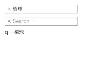
Stable · IME: Windows only
A variant of <input>: a magnifier on the left, and pressing Enter while focused submits the whole query via onSearch({value}) — a dedicated commit point on top of per-key onInput (like DOM search boxes). Everything else (controlled value / model / placeholder / caret / key ownership / IME) is identical to <input>.
| Prop | Type | Description |
|---|---|---|
| value / model / onInput / placeholder / width / disabled | — | identical to <input> |
| onSearch | function | dispatched on Enter while focused, receives {value} (string, the current controlled value); Ctrl / Alt combos are not consumed |
const [q, setQ] = createSignal("");

<search
  model={q}
  placeholder="Search…"
  width={260}
  onSearch={(e) => console.log("search:", e.value)}
/>
<input> vs <search>
<input> + onKeyDown can do "submit on Enter" too; <search> bakes the most common shape into a component — the icon signals a search slot, and Enter gets its own onSearch event, so there is no key-name checking in onKeyDown.
<rating>
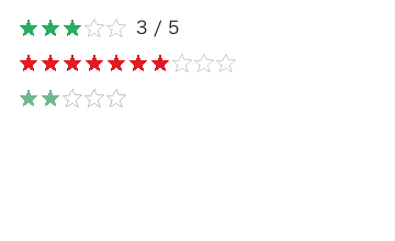
Stable
Star rating: each star occupies a cell; the first value stars are filled (overridable via color, defaults to the theme accent), the rest are outlined. Fully controlled (same philosophy as <select>): display follows value only, and clicking the i-th cell dispatches onChange({value}) — no dispatch when the value is unchanged (like the paginator). The model contract matches select: read value, write onChange.
| Prop | Type | Description |
|---|---|---|
| value | number | current rating (0 = all empty; display follows it) |
| max | number | star count, default 5, capped at 10 |
| color | color | filled-star color, defaults to the theme accent |
| disabled | boolean | disabled (no hit testing, desaturated) |
| onChange | function | dispatched on click, receives {value} (number, which star) |
const [score, setScore] = createSignal(3);

<rating value={score()} onChange={(e) => setScore(e.value)} />
<rating value={7} max={10} color="#e01b24" />Keyboard: after focus, ← / → subtract / add one star (dispatching onChange({value}); no dispatch when the value is unchanged); Enter / Space do not change the value (rating is "pick a star", there is no "open" step).
<textarea>
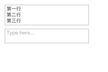
Stable · IME: Windows only
Multi-line text editing. The caret is two-dimensional {row, column}; content taller than the visible height scrolls vertically, and scrolling follows the caret (pressing Enter on the last line won't push the caret out of view).
| Prop | Type | Description |
|---|---|---|
| value | string / function | Displayed content, controlled |
| onInput | function | Receives {value}; one IME commit dispatches only once |
| rows | number | Number of visible rows, determines the default height |
| placeholder | string | Gray hint text when empty |
| width / height | number | Explicit size |
| onKeyDown | function | Does not include Enter (consumed by the editor), but Escape bubbles up |
| disabled | boolean | Not editable |
The Only Key Difference from <input>
In a multi-line box, Enter is content (it inserts a newline), so the editor consumes Enter; in a single-line box, Enter passes through to upper layers. All other key handling is identical — including Tab (Shift+Tab), which the accessibility layer consumes as "leave this field" instead of inserting a tab character.
const [text, setText] = createSignal("");

<textarea
  rows={4}
  width={260}
  placeholder="Type here..."
  value={() => text()}
  onInput={(e) => setText(e.value)}
  onKeyDown={(e) => {
    if (e.key === "Escape") closeDialog();
  }}
/>- No soft wrapping: overlong lines are clipped on the right instead of wrapping — line breaks are decided solely by \n, so "caret line numbers" map strictly one-to-one to the text.
- No selection, no undo stack, no horizontal scrolling.
<select>
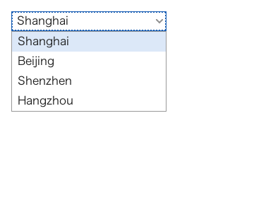
Stable · Popup
A dropdown. Clicking opens an options popup (with escape clipping built in — it won't be clipped by the 28px field box, nor covered by later siblings), with keyboard open/close and highlight movement.
| Prop | Type | Description |
|---|---|---|
| options | array | An array of strings, or an array of {value, label} objects |
| value | string / function | Current value; display follows only this |
| onChange | function | Dispatched on selection, receives {value} |
| placeholder | string | Gray text when no value is selected |
| width | number | Field width, defaults to content |
| disabled | boolean | Cannot be opened |
Keyboard: after focus, Enter / Space opens it, ↑ / ↓ moves the highlight (wrapping), Enter selects, Esc closes. When closed, ↑ / ↓ opens first; while open, Tab / Shift+Tab closes it before moving focus (Tab means "leave this field", and leaving a popup visibly open makes people think focus is still inside the dropdown).
const CITIES = [
  { value: "sh", label: "Shanghai" },
  { value: "bj", label: "Beijing" },
  { value: "sz", label: "Shenzhen" },
];

const [city, setCity] = createSignal("sh");

<select
  width={220}
  options={CITIES}
  value={() => city()}
  onChange={(e) => setCity(e.value)}
/>

<!-- Plain string arrays + placeholder are also supported -->
<select
  width={220}
  placeholder="Pick a fruit"
  options={["apple", "banana", "cherry"]}
  value={() => fruit()}
  onChange={(e) => setFruit(e.value)}
/>
Clicking Outside Swallows That Click
When the popup is open, clicking elsewhere only closes the popup; the click does not also land on the control underneath — avoiding "accidentally triggering a button while closing the dropdown".
<slider>
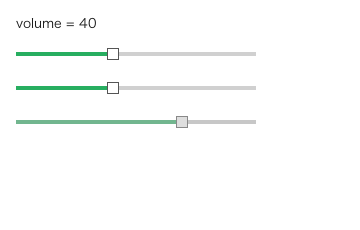
Stable · Exclusive dragging
A slider. Both dragging the thumb and clicking anywhere on the track to jump to a value update it; mouse capture during dragging is provided by the backend, so it stays attached even when dragged out of the window.
| Prop | Type | Description |
|---|---|---|
| value | number / function | Current value, determines the thumb position |
| onInput | function | Dispatched while dragging/clicking, receives {value} — a number, not a string |
| min / max | number | Value range, defaults to 0 / 100 |
| step | number | Step size, defaults to 1; step <= 0 means continuous values |
| width | number | Defaults to 160 |
| disabled | boolean | Cannot be dragged, uniformly desaturated |
const [vol, setVol] = createSignal(40);

h("slider", {
  width: 200, min: 0, max: 100, step: 5,
  value: () => vol(),
  onInput: (e) => setVol(e.value),     // e.value is used directly as a number, no parseFloat needed
}),

// Values only land on 0/2/4/6/8/10
h("slider", { width: 200, min: 0, max: 10, step: 2,
  value: () => zoom(), onInput: (e) => setZoom(e.value) }),

// Disabled state
h("slider", { width: 200, min: 0, max: 100, step: 5, value: 70, disabled: true })- No vertical slider, no dual-thumb range, no tick/value labels.
- Keyboard nudging works: after focus,
←/↓subtract onestepand→/↑add one (stopping at the endpoints, no wrapping), dispatching the sameonInput({value})as dragging — so withstep <= 0(continuous values) arrows move by 1. - Dragging is an exclusive gesture: while dragging, hovering over other controls doesn't highlight them.
- Abnormal range values are handled safely: max < min collapses to min, and NaN never pollutes the geometry.
<label>
Stable
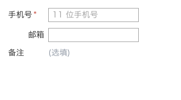
Field label. Single-line text plus an optional required asterisk; with align="right" the whole label hugs the right edge of the content area (right-aligned label columns are the most common form layout need).
| Prop | Type | Description |
|---|---|---|
| required | boolean | Draws a red * after the text |
| align | "right" | Right-aligned; defaults to left |
| width / height | number | The label column is aligned via width (see the example below) |
| color / font | — | Same as every element, inherited along the ancestor chain |
<row gap={8} alignItems="center">
  <label width={72} required>手机号</label>
  <input model={phone} placeholder="11 位手机号" />
</row>

<row gap={8} alignItems="center">
  <label width={72} align="right">邮箱</label>
  <input model={mail} />
</row>
The Asterisk Is a Marker, Not Content
The text content of <label required>姓名</label> is still "姓名" — the asterisk does not enter TextContent(), nor the accessible name, and never leaks into form values. Purely visual markers must not pollute the data plane.
<form>
Stable
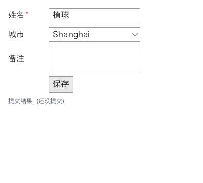
A form container: vertical stacking (semantics identical to <column>), default row gap 10px, and the owner node for Enter-to-submit and whole-form value collection.
| Prop | Type | Description |
|---|---|---|
| gap | number | Row gap, default 10 |
| onSubmit | function | Receives {values} — a {name: value} object |
| others | — | Same as column (padding / background / width …) |
const [name, setName] = createSignal("");
const [note, setNote] = createSignal("");
const [birthday, setBirthday] = createSignal("");
const [tint, setTint] = createSignal("#1e88e5");
const [files, setFiles] = createSignal([]);

<form gap={12} padding={16} onSubmit={(e) => save(e.values)}>
  <row gap={8} alignItems="center">
    <label width={72} required>姓名</label>
    <input name="name" model={name} />
  </row>
  <row gap={8} alignItems="center">
    <label width={72}>出生日期</label>
    <datepicker name="birthday" model={birthday} />
  </row>
  <row gap={8} alignItems="center">
    <label width={72}>主题色</label>
    <colorpicker name="theme" model={tint} />
  </row>
  <row gap={8} alignItems="center">
    <label width={72}>附件</label>
    <upload name="resume" model={files} accept=".pdf,.png" />
  </row>
  <row gap={8}>
    <label width={72}>备注</label>
    <textarea name="note" model={note} height={60} />
  </row>
  <button onClick={() => submitForm()}>保存</button>
</form>- Enter submits: with focus in an
input/search, pressingEntersubmits the surrounding form (the same intuition as an HTML<input>submitting its form on Enter). With focus on a button / checkbox / dropdown,Enterbelongs to that control and does not submit as a side effect. - Only fields with a
nameare collected: same as HTML forms. Fields withoutnamedon't entervalues, so the backend doesn't receive a pile of empty keys. - Values are always read from the controlled prop: so the only reason "the submitted value is stale" is that the script never wrote the
onInput/onChangeresult back into the signal (that's the definition of controlled, not a bug). - Fields inside a closed popup don't count (their values don't belong to this submission).
<datepicker>
Stable · Popup · Purely controlled
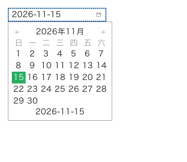
A date picker: a 28px field row (current value + calendar icon on the right); clicking opens a calendar popup (month header ‹ 2026年11月 › + weekday row + day cells + an echo at the bottom). Same "field + field-attached popup" interaction model as <select> (the popup carries escape clipping).
| Prop | Type | Description |
|---|---|---|
| value | string / function | Current date, format "YYYY-MM-DD". Unparseable formats are treated as no value (the placeholder shows); it never guesses a nearby date |
| onChange | function | Dispatched on selection, receives {value} (string, "YYYY-MM-DD") |
| min / max | string | Optional range ("YYYY-MM-DD"). Out-of-range cells are drawn gray and clicking them does nothing |
| placeholder | string | Gray text when there is no value, default 请选择日期 |
| width | number | Field width, defaults to content (no less than 130) |
| disabled | boolean | Cannot be opened |
Keyboard (after focus):
| Key | Closed | Open |
|---|---|---|
Enter / Space | open | pick the cursor's day |
← / → | open | ± 1 day (may cross months) |
↑ / ↓ | open | ± 1 week |
PageUp / PageDown | open | ± 1 month (day clamped to the target month's length) |
Home / End | — | first / last day of the month |
Esc | — | close |
const [birthday, setBirthday] = createSignal("");

<datepicker model={birthday} />

<datepicker
  value={birthday()}
  onChange={(e) => setBirthday(e.value)}
  min="2020-01-01"
  max="2030-12-31"
  placeholder="请选择日期"
/>- The field displays the
valueverbatim; days outsidemin/maxare drawn gray (today's cell gets an accent outline). - "Today" only drives the outline and "which month to open on when there is no value" — it never participates in the value: the default value is still empty, it won't silently pick today for you.
- v1 boundary: only
"YYYY-MM-DD"is accepted; no range selection, no time part; the popup does not flip upward (a field hugging the window's bottom edge gets its popup clipped).
<colorpicker>
Stable · Popup · Purely controlled
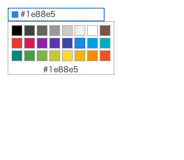
A color picker: a 28px field row (a swatch on the left + hex text); clicking opens a palette popup (N×M swatches + an echo of the cursor color at the bottom).
| Prop | Type | Description |
|---|---|---|
| value | string | {r,g,b} / function | Current color. Strings are shown verbatim (#rgb / #rrggbb / #rrggbbaa all parse); objects are converted to #rrggbb from {r,g,b} (0~255, same field names as the canvas ImageData) |
| colors | string[] | The palette; default 24 colors (grays + a color ring). Passing [] explicitly means an empty palette (typically "the palette hasn't loaded yet") — it does not fall back to the default |
| columns | number | Palette columns, default 8 |
| onChange | function | Dispatched on selection, receives {value} (the clicked palette string) |
| placeholder | string | Gray text when there is no value, default 选择颜色 |
| width | number | Field width, defaults to content |
| disabled | boolean | Cannot be opened |
Keyboard: Enter / Space opens (press again to pick the cursor's swatch); ← / → move one cell, ↑ / ↓ move one column; Home / End first / last cell; Esc closes. Arrow keys stop at the edges instead of wrapping (the palette is two-dimensional — wrapping would make "press up" jump to the bottom).
const BRAND = ["#1e88e5", "#43a047", "#fdd835", "#e53935", "#000000"];
const [tint, setTint] = createSignal("#1e88e5");

<colorpicker model={tint} />

<colorpicker value={tint()} colors={BRAND} columns={5}
             onChange={(e) => setTint(e.value)} />

// The value can also be written as {r,g,b}
<colorpicker value={{ r: 30, g: 136, b: 229 }} colors={BRAND} />- The small swatch on the field is filled with the current value; an unparseable value draws an empty box — an empty box makes it easier to notice a typo than "a wrong color".
- Case / whitespace differences of the same color (
"#FFF"vs"#ffffff") never cause a spurious dispatch: clicking the current value dispatches noonChange. - v1 boundary: preset palettes only — no color wheel (HSV ring + saturation square), no eyedropper, no custom color input. For arbitrary colors, write your own
<canvas>+onDraw, or collect a hex string with an<input>.
<upload>
Stable · Controlled/uncontrolled dual-mode · Needs the platform dialog
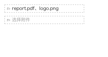
File picking: a 28px dashed-border field row (folder icon + the file names of the chosen files). Clicking directly opens the platform's native "open file" dialog (no popup).
| Prop | Type | Description |
|---|---|---|
| value | string[] | {name, path}[] / function | Its presence means controlled: an array of strings (paths), or of objects (the path field is used). Without it the component keeps its own list (uncontrolled) |
| onChange | function | Dispatched after picking, receives {files, paths}: paths is a string array, files is [{name, path}] |
| multiple | boolean | With true each pick accumulates; default false replaces |
| accept | string | HTML accept-style suffix list, e.g. ".png,.jpg" or "image/*" |
| filter | string | string[] | {name, pattern} | The full-form filter rules, e.g. `"图片 |
| title | string | Native dialog title, default 选择文件 |
| placeholder | string | Gray text when nothing is picked, default 选择文件 |
| width | number | Field width, no less than 180 |
| disabled | boolean | No dialog |
Keyboard: after focus, Enter / Space opens the file dialog.
// Uncontrolled: shows immediately after picking (internal list), onChange as notification
<upload multiple accept=".png,.jpg" onChange={(e) => upload(e.paths)} />

// Controlled: display follows value only; the script writes back after picking
const [files, setFiles] = createSignal([]);
<upload value={files()} multiple
        onChange={(e) => setFiles(e.paths)} />

// Structured filters + custom title
<upload title="选择附件" filter={["图片|*.png;*.jpg", "所有文件|*.*"]} />
A Missing Capability Means "Clicking Does Nothing" — It Never Invents File Names
<upload> relies on the window backend's native dialog capability (the openFile of gx/dialog). On backends without it (e.g. Linux X11) a hint goes to stderr and the result is "nothing picked"; the <upload> field just shows "clicking does nothing" — deliberately: it never silently invents a fake file name to fill in, which would make business logic believe a file was actually picked. To know in advance, check canIUse("dialog").
Pressing cancel dispatches no onChange either: cancel is not "picked nothing".
- v1 boundary: the underlying dialog returns one path at a time, so
multiplemeans "accumulate across picks"; no drag-and-drop into the field, no upload progress (that'sgx/http's job — the component only covers "picking files"), and no per-file remove cross — changevaluein the controlled mode, or pick again in the uncontrolled mode.